Hi there!!
As everybody knows, we're currently living a really complicated moment in our country and other parts of the world because of the coronavirus... We usually try to get children out of these types of problems, but I think that we could use it to continue teaching them about measurement.
In this case, we could show different ways to represent the data of the infected people in Spain, such as the following examples:
We can use a cartogram. With circles of different size, indicating on a map the number of people infected in each autonomous community (taking as a reference the 21st May):
We can use a population pyramid so as to show the distribution of cases by sex and age in Spain:
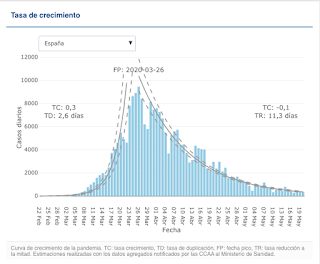
The evolution of the pandemic in Spain. I mean, its growth curve. We could show it with a bar graph:
It's evident that there are a lot of ways to represent the data, but here I've shown you several examples. If you want to work it with students, you could show them some example like these ones and then, they could create their own representations of data, following your indications. I'm sure they will enjoy it and, at the same time, they are learning about something important and contemporary. I believe that I'd use this type of activities in the 6th grade, but it's up to you!
What do you think about that??
See you in the next post! Bye bye!


No hay comentarios:
Publicar un comentario